my work
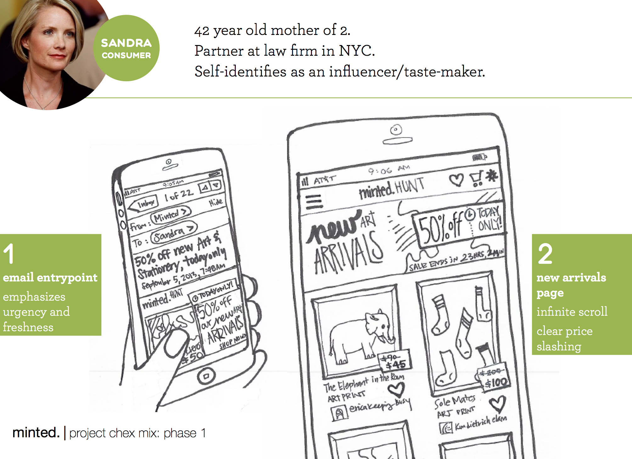
art marketplace concept
Animated concept for the art marketplace
Problem
Minted began as a stationery company. We discovered that the needs/wants/behaviors of art shoppers are ≠ stationery shoppers so we worked to create an experience that was tailored to this new customer.
Solution
Using proto-personas as a guide, I brainstormed with a cross-functional team to generate ideas which led to the creation of a more simplified and immersive art shopping experience. It was mobile-first and featured a product detail page overlay (to enable swifter browsing + multi-product purchase).
Results
Elements of the design have been tested and rolled out to multiple product kinds, leading to an overall increase in conversion in art. Product detail page updates are rolling out soon.
low-fidelity concepts
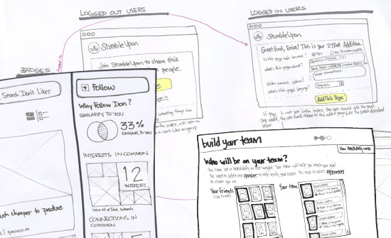
sketches from a range of projects
concept sketching
Problem
Mockups and high-fidelity wireframes make ideas real—but sometimes TOO real. In the early stages of product design, jumping to mockups too quickly can lead to churn or erroneous concept-selection.
Solution
Sketches help clarify ideas, spur discussion, encourage collaboration, and move things forward without limiting options. So I try to sketch on whiteboards, post-its and paper whenever I can.
Results
More sketches = more collaboration = better outcomes.
digital invitations - early prototype
Preliminary prototype
Problem
It was 2013 and Minted was considering an expansion into the digital invitations market. After conducting user interviews, we found that “dancing envelopes” and other industry standards weren’t meeting customer needs.
Solution
I created a concept that “felt like Minted” (photo-realistic styling), met customer needs and was differentiated from other existing digital invitation providers. This is one of many early prototypes that we tested with customers.
Results
This concept helped us visualize some intial ideas and informed further iterations. Minted's digital invitations product is currently in beta and features some of the components of this early prototype.
“kitten” page system
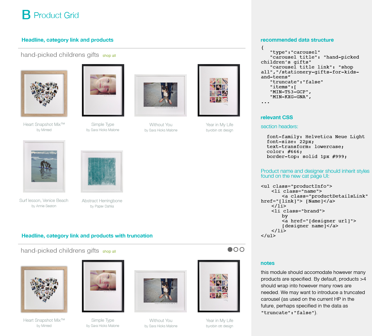
Example documentation for the “kitten page”
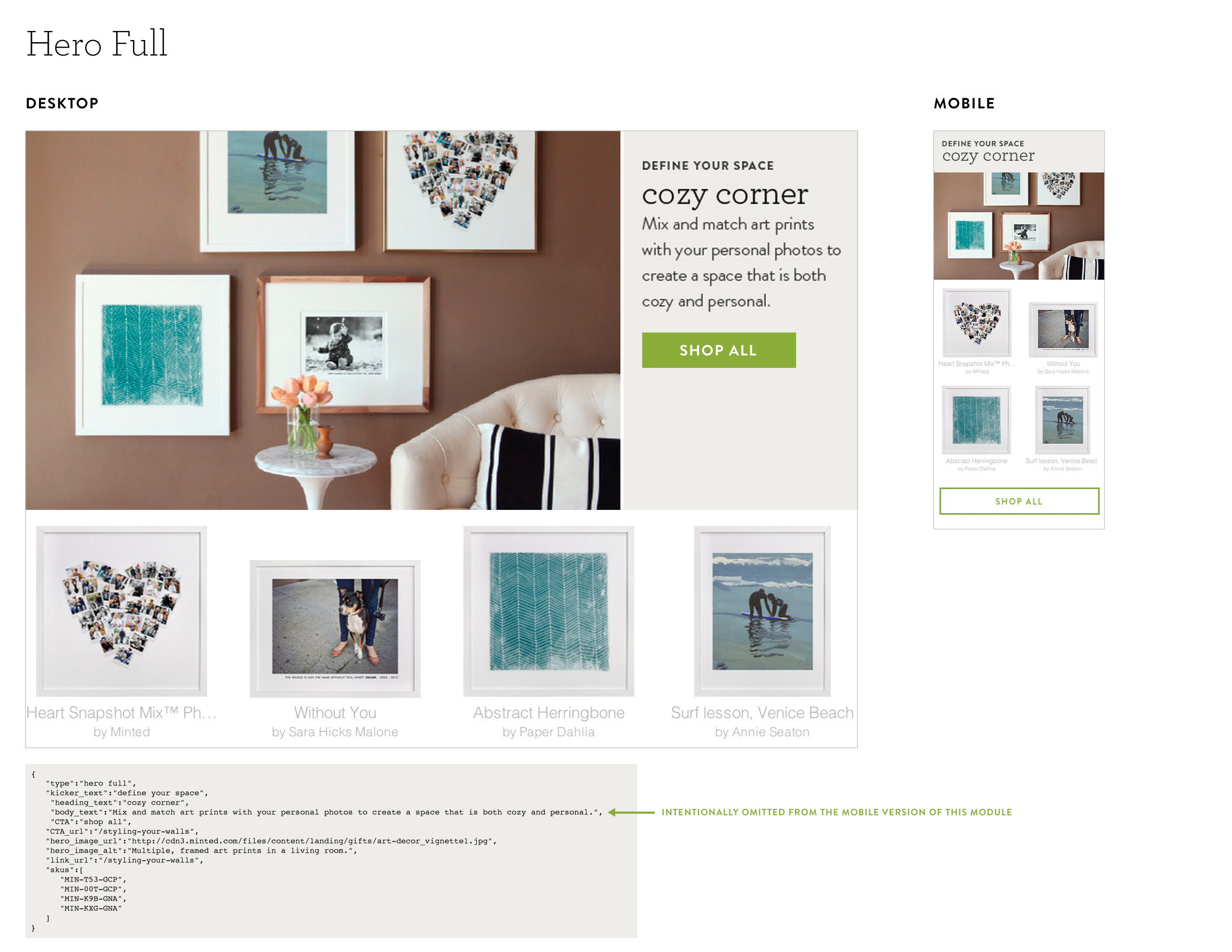
Plans for mobile optimization of existing “kitten page” modules
Problem
When I joined Minted, all landing pages were full-page images with embedded text (yuck). And, despite being technically primitive, they required engineering intervention to launch.
We needed pages that featured SKUs + online merchandising space which business users could configure and launch at any time, sans-engineering.
Solution
Since many of these pages were going to precede category pages, I named the project “the kitten page”—because kittens are pre-cats.
After collecting the needs of stakeholders, I designed a series of reusable, configurable modules. I then partnered with engineering to come up with a simple JSON structure that leveraged our existing CMS. I pitched the project to our CEO and we built it.
Results
Since launch, dozens hundreds of kitten pages have been created (like this one and this one). They have broadened product-line awareness, increased SEO conversion rates and enabled low-cost experimentation.
Based on this success, we are working on building more modules that are responsive and more SEO-friendly. What I'm most proud of, however, is that the term “kitten page” is now a part of the Minted lexicon.
organizing likes on StumbleUpon
Exploratory sketches for an early (abandoned) concept for Lists
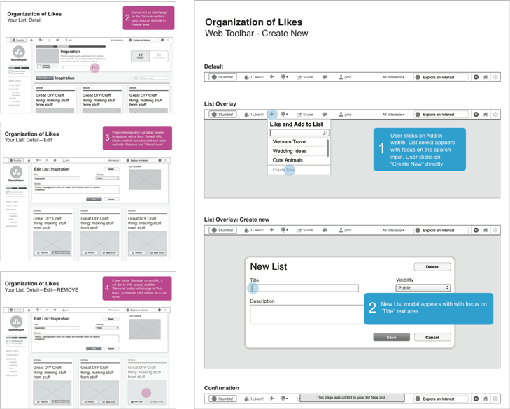
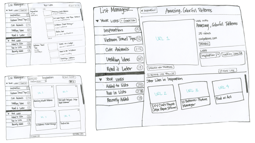
Wireframes for Lists
Problem
Avid Stumblers had many “Likes” and no way to organize or re-discover their curated content.
Solution
We developed a feature that allowed users to group their Likes into Lists of content.
Results
In less than a month after launch, over 45,000 Lists were created by users in the StumbleUpon community.
This is just a glimpse of my work. And, sorry, most of the good stuff is NDA’d.
I have been designing/leading the design of user experiences for over 14 years now, so I have a lot more projects I can share. Additionally, these work samples show a tiny snapshot of my design process. For the sake of brevity (and confidentiality) I have omitted many of the insights, constraints, failed concepts and results of these projects. I find those details to be more interesting than the actual solutions, so I've developed some case studies that I am happy to share in person.
Contact me at erica.meade@gmail.com if you'd like to see additional projects or case studies.